Skolay

Skolay is a mobile platform for 1:1 conversations between writers & readers.

Readers want to interact with their favorite authors to have an impactful and meaningful conversation, yet they lack such remote resources in the literary world.

An app to create a correspondence platform for the literary world where writers (fellows) and readers can have more in-depth, meaningful conversations. Skolay aims to create an empathetic, dynamic and engaging community.

We researched, designed, and delivered around our key objectives:

  • Accelerate user acquisition
  • Increase brand visibility and retention
  • Reduce the barriers to recruiting authors, especially older users (a primary demographic)

Project Timeline

6 weeks

Team

Daania: UX Design

Thomas: UX Research

Kiki: UX Research

Platform

Beta-iOS

Tools

Figma

Maze

Research deep dive

To start our journey with Skolay, we began by researching Skolay, their needs, pain points, and goals to understand how we could benefit them.

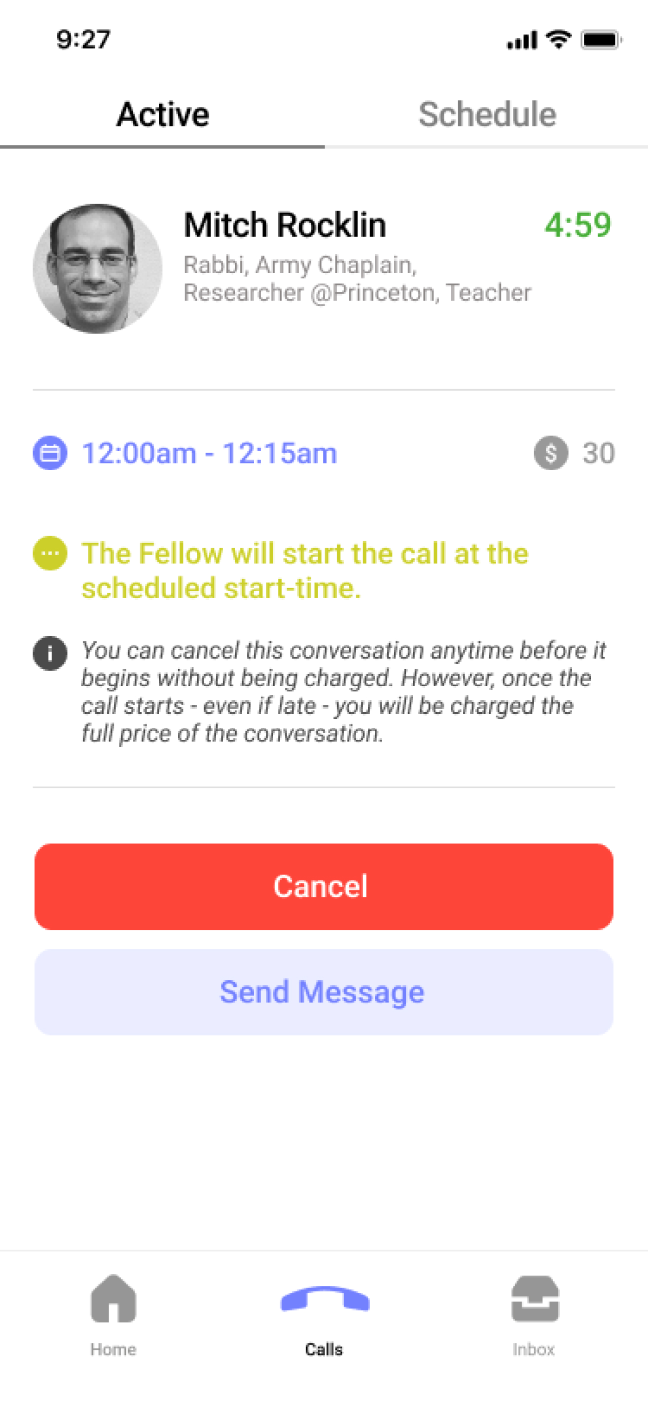
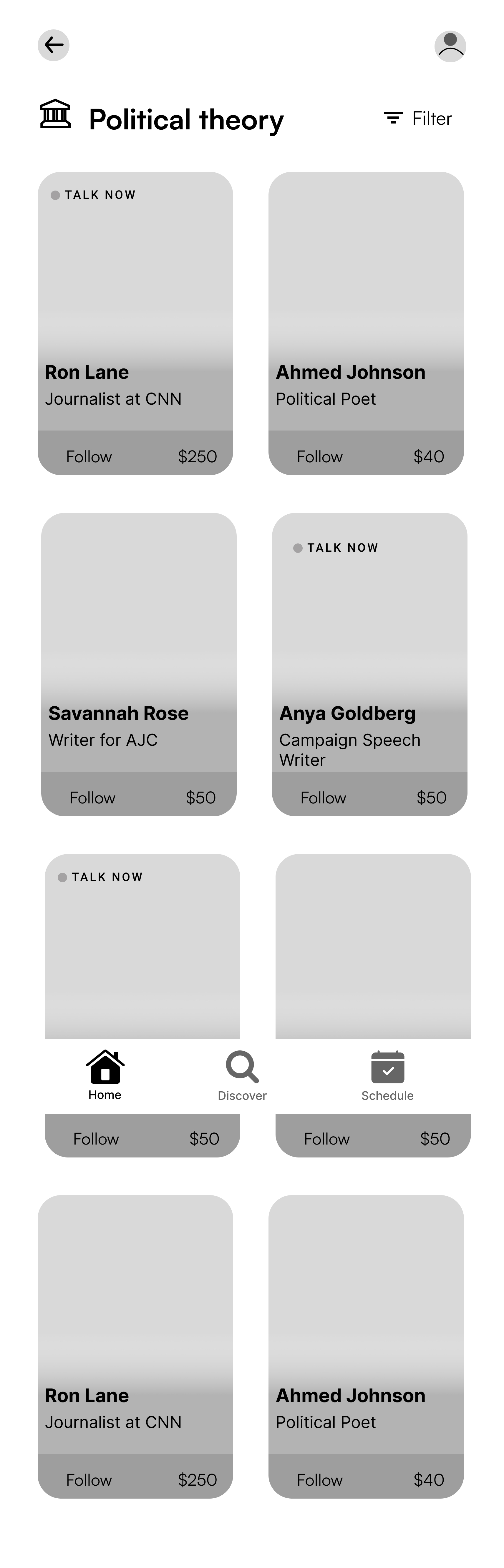
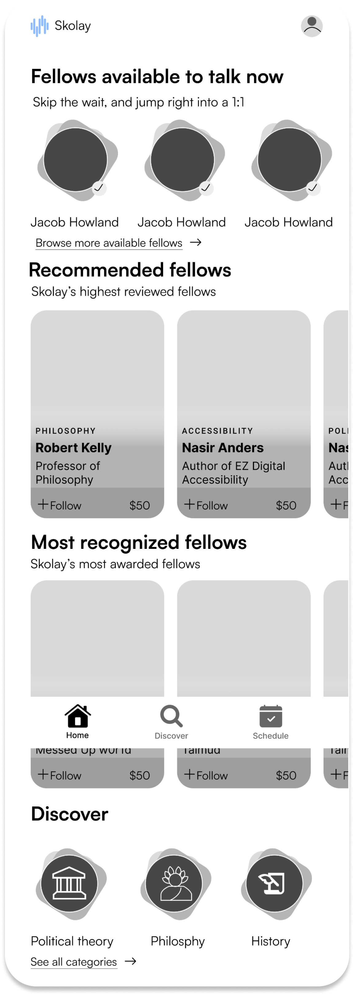
After conducting the initial interview with Skolay stakeholders, we sought to gain insight into the competitor space that Skolay is also deep diving into in need of the reader and writer interaction.

Research Deep Dive Meeting

Research Methods

Comprehensive data collection and analysis approaches

Questionnaire

28 responses

Interviews

10 interviews

Usability testing

10 responses

Competitive analysis

7 companies

Key insights

We began user research by utilizing a questionnaire and a series of one-on-one interviews to gain a deeper understanding of trends within the questionnaire.

We designed our questions to learn more about:

  • Users reading behavior
  • Reader and writer interaction
  • Building connections
  • Engaging in audio calls or video calls
  • New application usage
01

Social media impact

Social Media plays a vital role in reader/ writer interaction in today's digital world

"Social media makes it easier for me to interact with and see content from writers I like."

02

Making informed interactions

Users would like an in-depth Fellow bio before they schedule a 1:1

"I like to see the bio of an author, his recent books, past books, or any potential future books in work."

03

Conversations causes anxiety

50% of users would have hesitations having a 1:1 with a fellow stemming from anxiety.

"Anxiety-provoking to be honest. I think the fear of not being able to verbalize effectively in situations with"

04

Building trust

Users build trust in newer apps through data privacy, and testimonies.

"Easy of use and privacy and also if my friends recommend it will help me in deciding to use app"

Testing Beta app with users

We tested beta Skolay with 14 participants using Maze. This test aimed to identify users' pain points while completing the scheduling, preparation, and participation in the 1:1.

Home screen

Home screen

  • Lack of visual hierarchy
  • Unclear user flow for action
Fellows profile

Fellows profile

  • Lack of information on fellow profiles.
  • Clarity needed for talk now feature.
Calendar view

Calendar view

  • Users directed themselves to this calendar screen in hopes to attend the scheduled call.
Active call

Active call

  • Users cancelled the call on this screen i/o attending.
  • Anxiety built up in users when fellows abruptly called.

Now that we understand user, we refined our problem for our primary user and Skolay to guide our next steps.

Users need an accessible, intuitive, and trustworthy way to connect with their favorite fellows in order to have engaging and meaningful 1:1 conversations about their inspirations & creative process.

Skolay provides a platform that offers 1 on 1 conversations between fellows and readers. However, there is an opportunity to improve the scheduling, preparing, and conducting 1:1s that feels natural and anxiety free for users.

Designing towards solution

We started the design phase by sketching wireframe solutions based on the synthesis of our persona of Sam, our problem statement, our beta app testing, and the features Skolay required.

With sketching, we kept some key aspects about users in mind.

  • Reduce anxiety within users
  • Building trust in Skolay's platform.
  • Help users make informed decision
  • Providing clear experience for joining 1:1s

REDESIGN HOMESCREEN

Personalized homescreen

We redesigned the home screen to present information more streamlined and personalized way. Furthermore, as we planned to introduce onboarding to retain more users, we thought it would be a great way to ask users about their interests during the onboarding process and recommend fellows based on users' interests. This would help to create a more engaging experience for first-time users.

Redesign helped in the easy exploration of fellows

Home/Discovery Screen
Added filter option
Discover Categories Screen
Talk now feature
Fellow cards with subject expertise
Category View Screen
Filter Overlay

UPDATED FELLOWS PROFILE

Added reviews, works and posts

We also revised the fellow profile page to include a list of their works, reviews left by users who attended 1:1s with them, and social media functionality so fellows can communicate with their readers within the app. Our goal was to allow users to make more informed decisions about which fellows they schedule 1:1s by utilizing these features.

Updated Fellows Profile
Engage → Follow or Message
Explore → Work & Reviews
Support → Earnings to Charity
Book → Quick calendar access

WAITING ROOM

Over-designing for anxiety

To alleviate the anxiety and confusion users felt while waiting for the 1:1 to start, we added a waiting room. This serves as an area for the user and fellow to meet before the 1:1 starts. This allows both parties to collect their thoughts and receive visual feedback before the 1:1 starts.

Redesign 6 with Annotations
Wait Room → Notify users to join
Message Option → Send quick "running late" notes
Interactive Call → Mute, Notes, Speaker options

Testing and iterating

With our mid-fidelity prototype completed, I conducted our next round of usability testing. For this session, we conducted both moderated and unmoderated maze-based testing.

Our main tasks covered scheduling a call with a fellow and completing a 1:1 audio conversation to meet MVP, and our sub-tasks covered exploring the app and home screen and trying out the onboarding process.

90% of our users completed our major tasks by following the expected path and described the entire experience as 'intuitive'

Majority of our testers appreciated our onboarding flow, adding questions for 1:1, and exploring & discovering new fellows within literary subjects.

Build Connections Screen

Build Connections

1:1 Questions Screen

1:1 Questions

Discover Categories Screen

Discover categories

1. Adding clear information about cost for 1:1

Users were surprised by payment requests after scheduling 1:1 sessions. We redesigned UI elements to clearly display pricing and payment options, increasing font weight, and adding session length information.

Fellow Top Profile with Animated Ring
Active Fellow → Animated profile ring
Individual Fellow Card

2. Adding sub-copy on home screen

Users were curious about how they received recommendations on their home screen and what each section on the home screen meant.

  • In high fidelity, we added sub copy to all sections.
  • We provided an engaging onboarding experience to curate content based on users' selections.

3. Adding new 'Feed' screen

All of our testers were confused about the value proposition 'following a fellow' offered them.

  • Introduced a feed page to consolidate posts by all fellows that users follow.
Your Feed Screen
Posts by Fellows from Subjects You're Interested In
Recommendations → More posts + follow options

Style guide

We built a style guide for future development of the Skolay platform after we worked on the screens. To increase brand visibility and retention, we wanted to develop a concise and distinctive visual motif that can be used across our app, social media, and marketing materials.

Skolay Style Guide

Final Design

With all the updates we proceeded to a high-fidelity solution and finished up our MVP product for the Skolay team. We compiled all our files in one Figma file and handed it off to the Skolay team for future use.

Based on usability testing we received the below results:

  • 80% reduction in click error rate by simplifying user flows backed by usability testing of the app.
  • Increased user confidence from 30% to 60% in scheduling audio calls by providing tools for verification.
  • Grew app interaction by 3x with the addition of open forums for users to interact with the community in trials.

Fellow's profile

We built flows that showed our fellows' profiles in detail. Our prospective users can see profiles, work, reviews, and availability before making an account.

Creating user profiles later in the flow helped acquire valuable users while avoiding overflowing ghost accounts.

Interactive audio call

Given how we had technical limitations of Skolay being Audio only platform, we built a concise interactive experience.

To alleviate users' anxiety and confusion while waiting for the 1:1 with a recognized fellow, we ensured all interactions kept our users engaged on the platform.

Rich onboarding experience

To reduce the barriers to recruiting older users (a primary demographic), we designed and tested a new onboarding flow for our app.

View prototype

If I had more time…

Usability testing

Validate the high-fidelity prototype with users.

Expanded flows

Add scheduling, joining, calling, and personalization.

UI cleanup

Reduce home screen clutter and refine layout consistency.

My Learnings

🧩

Communicating complexity

Turned ambiguous, strategic problems into clear, audience-friendly stories.

🤝

Client collaboration

Learned to set scope early through open, frequent communication.

🔄

Iteration mindset

Embraced multiple rounds of testing to build user + client trust.

Let's work together

I'm always interested in new opportunities and collaborations.